perma farm

Sipsmith

Challenge

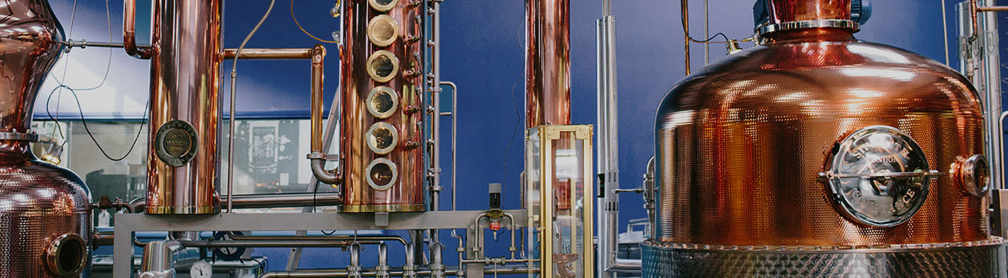
Sipsmith is the first copper-pot distillery to open in London in the past two hundred years. Six years ago, its founders made their dream of bringing quality gin back to London come true. They are committed to producing gin the old school way and are always open to experimentation.

London is full of gin distilleries which makes it hard for a small distillery to stand out and be successful. There are big competitors like Tanqueray and Beefeater that have already established themselves on the market.

Proposed Solution

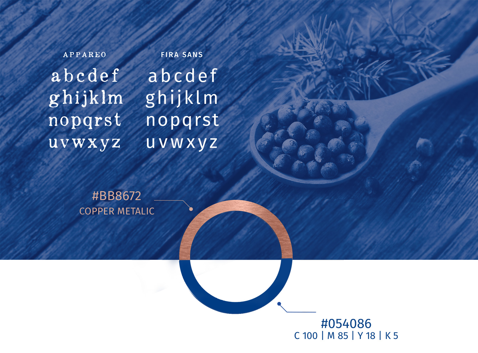
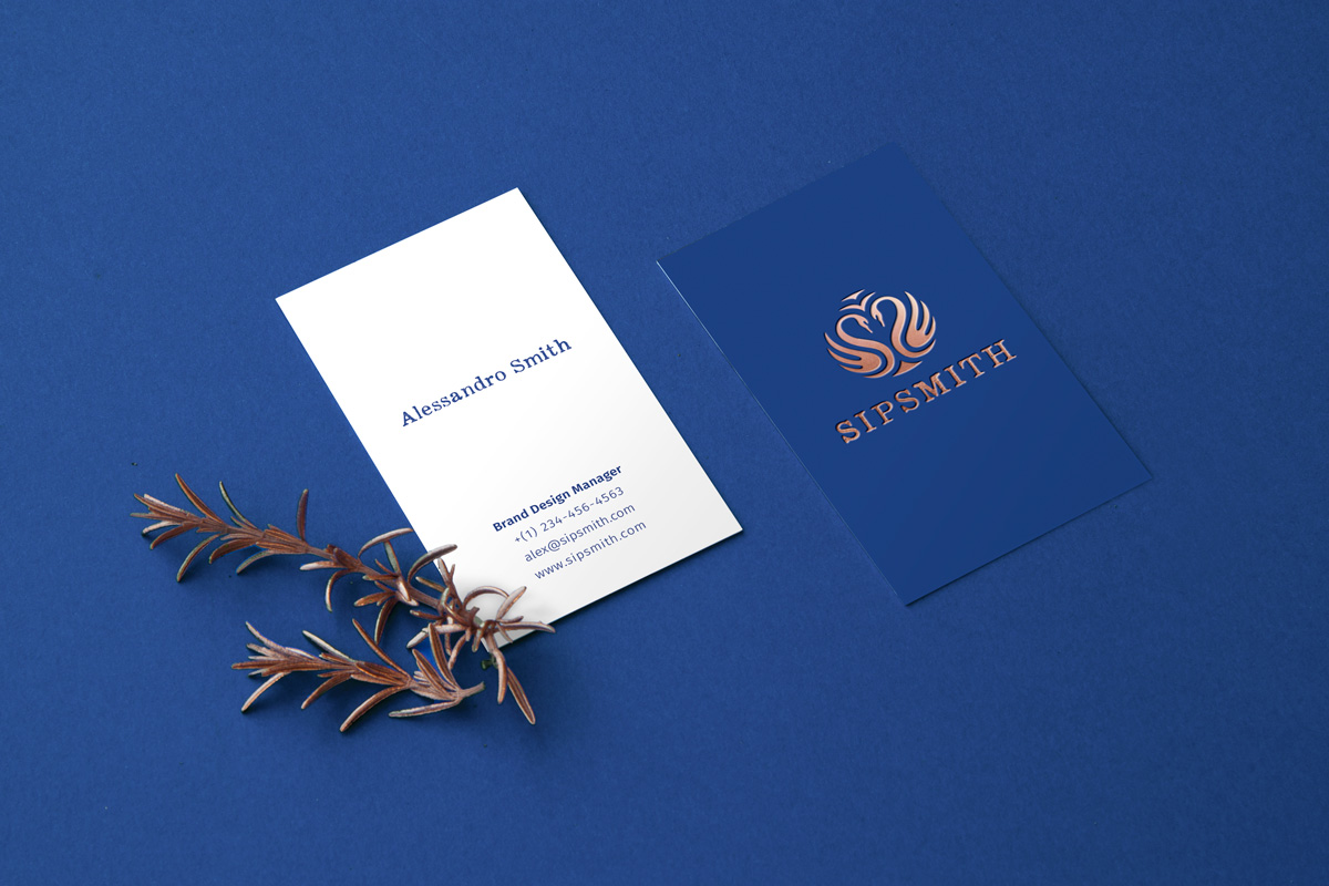
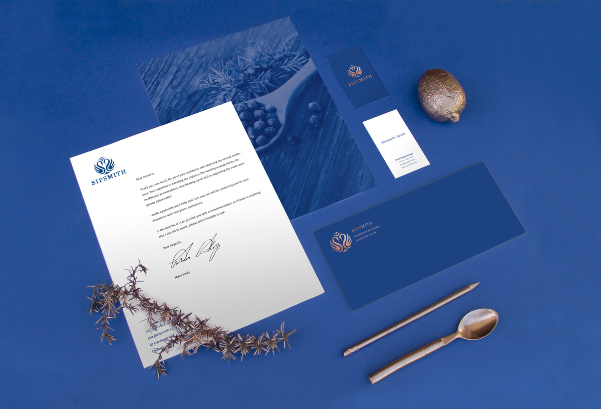
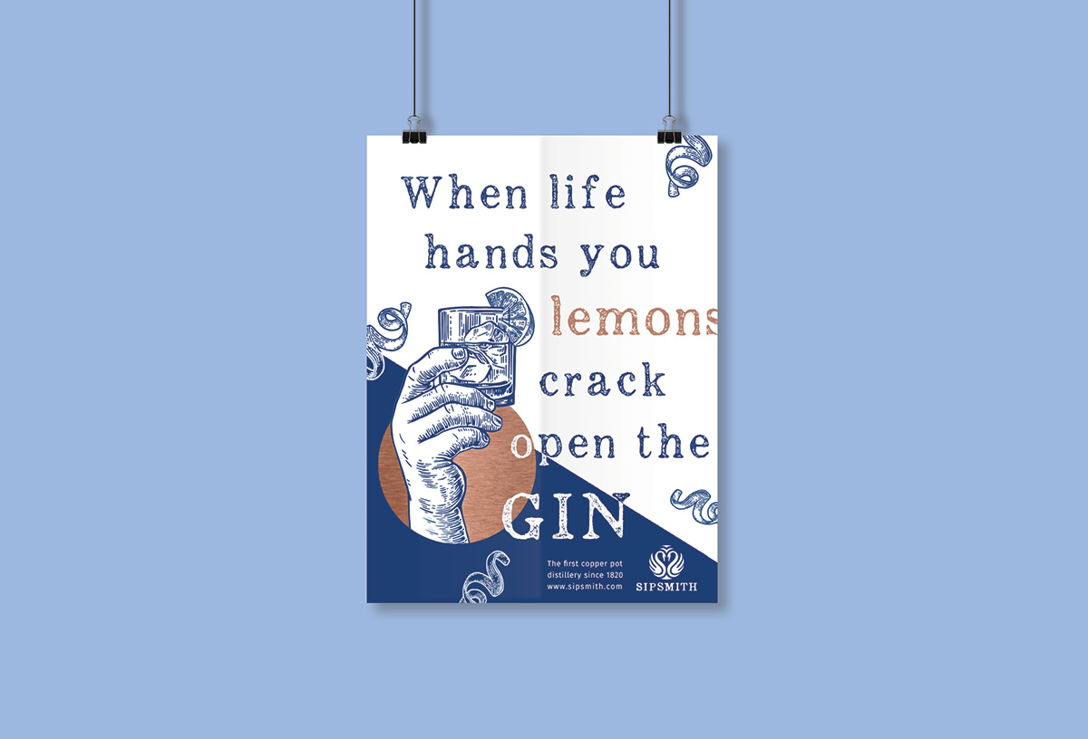
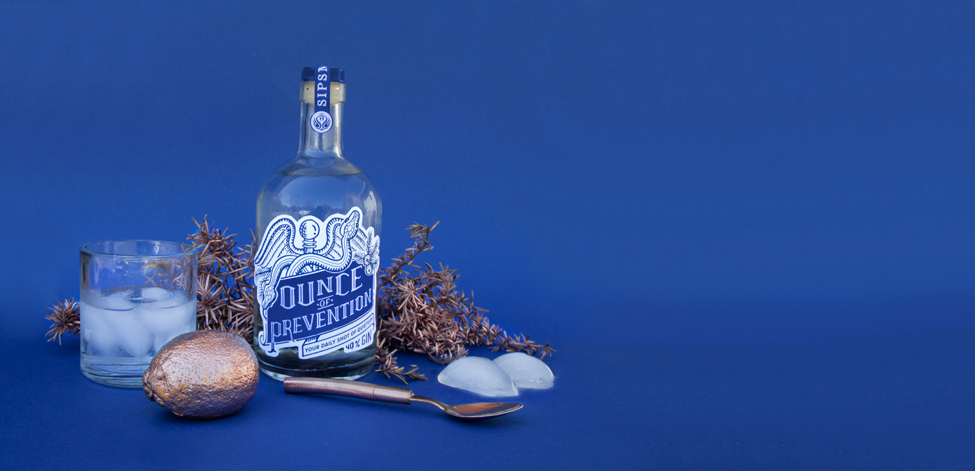
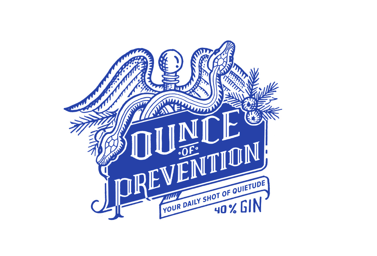
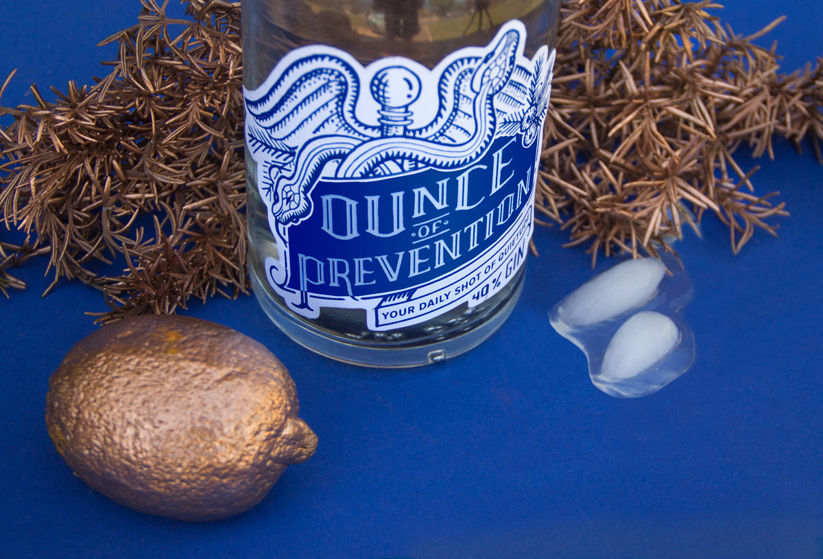
New branding emphasizes the uniqueness of Sipsmith’s copper pot distillation process, the earliest style of gin production. Label design highlights the medicinal qualities of gin. It presents Sipsmith's gin as traditional and well-crafted.

Identity Exploration

  • logo-sketches
  • logo-sketches
  • logo-sketches
  • logo-sketches

Identity Analysis

Brand colors are inspired by juniper berries and copper pots that the distillery uses. Distressed typeface gives the brand a historical feeling. "Swan necks," the uniquely-shaped parts of the copper pots used, are the inspiration for the logo.

product design
logo design

Branding Touchpoints

  • business card design
  • letterhead design
  • letterhead design
signage design
  • label design
  • label design
alcohol label design design

A Shot of Quietude

Historically, gin has been known for its medicinal qualities. During English Imperial times, gin and tonic was used to prevent malaria. Today, gin is believed to help with blood circulation and kidney disease. On top of that, what can be more relaxing after a long day than a drink filled with botanical notes?

The concept for the label plays with the idea of gin as medicine. Just as a prescription is written based on individual needs, each badge of Sipsmith gin is uniquely crafted for customers to enjoy.

  • label design
  • label design

The photograph above is from sipsmith.com