Sherwin Williams Re-design
Sherwin-Williams is a specialty paint and paint supplies retailer that has a strong commitment to the environment. While being an industry leader in developing advanced paints and coatings, they meet the most strict environmental regulations.
Challenge
Retailer's current identity does not reflect their commitment to the environment or technological advancement. In fact, it communicates the opposite. The red paint "cover[ing] the earth" evokes ominous feelings and looks anti-environmental. On another hand, Sherwin Williams logo has been used for 150 years and became quite iconic and recognizable.
There is also a room for improvement in packaging design that could be more consistent and cohesive.
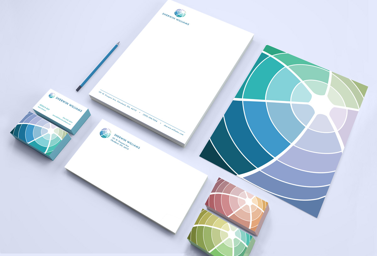
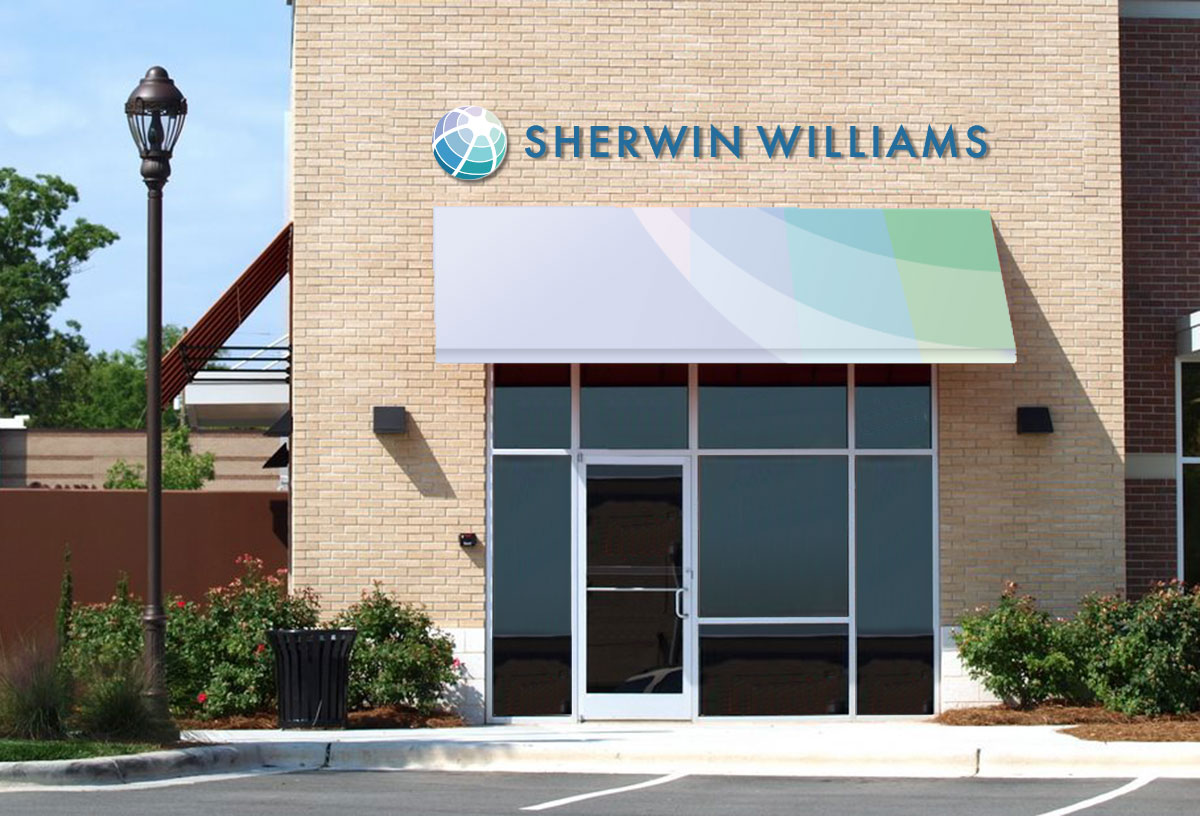
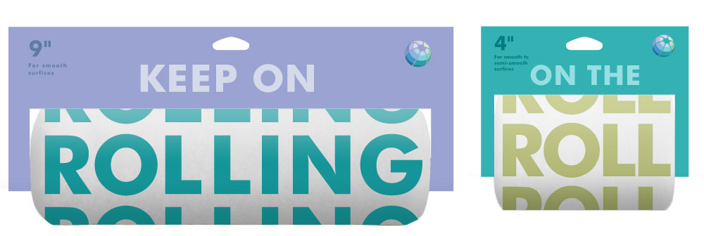
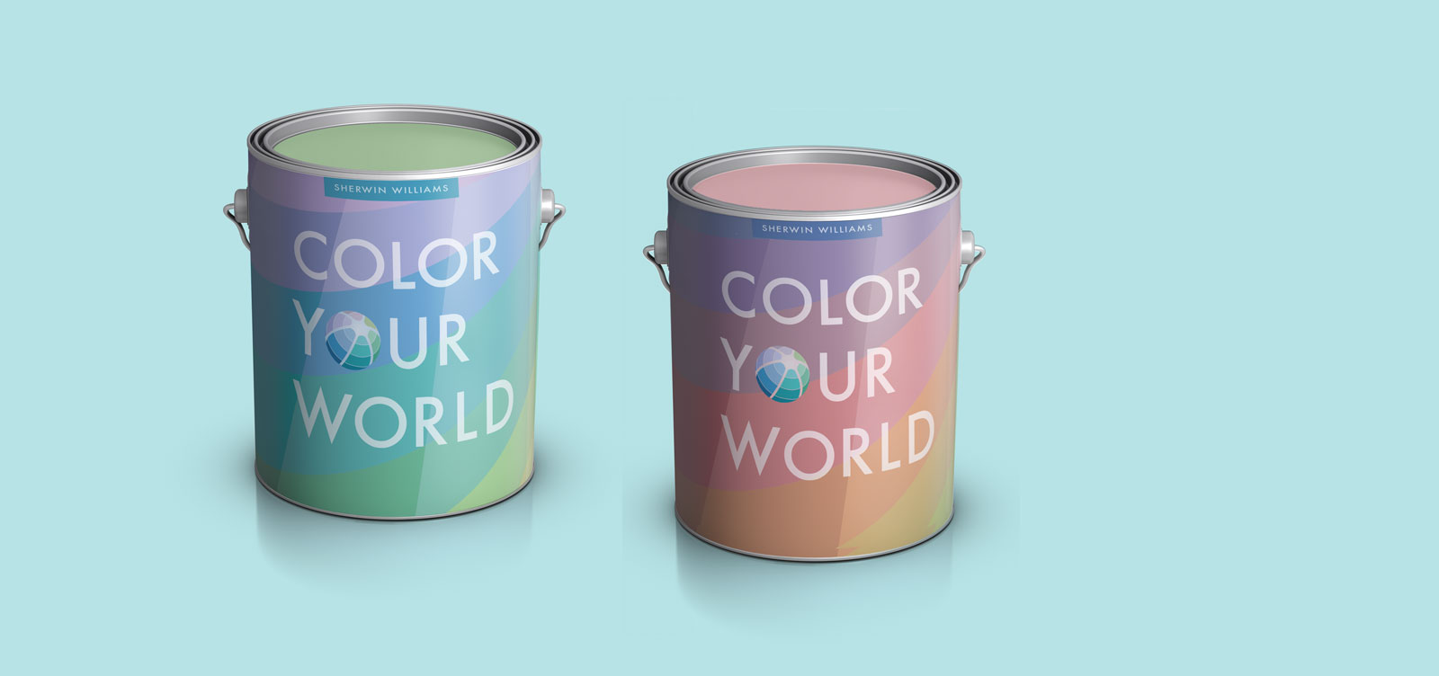
Solution
The new identity uses symbols of the globe and the world to relate to Shewin Williams's existing identity. Yet, the paint makes up the world instead of covering it, sending a message that's more appealing to the environmentally concerned customers. The packaging system is expandable across many products that the company makes. It looks fresh and clean, just like a new coat of paint.