Jobs To Be Done
As an hourly employee, when I’m off work, I want to have a control over my schedule and earnings, so that I know what I can do and when I can do it.
Project overview
Problem: HotSchedules is a restaurant management software that helps managers create schedules and allows employees to view and change their schedules online. Unfortunately, the employee home page hasn't been redesigned for seven years providing users with a poor and outdated experience. I was the sole designer on the project, collaborating closely with the product manager, product owner, and developers.
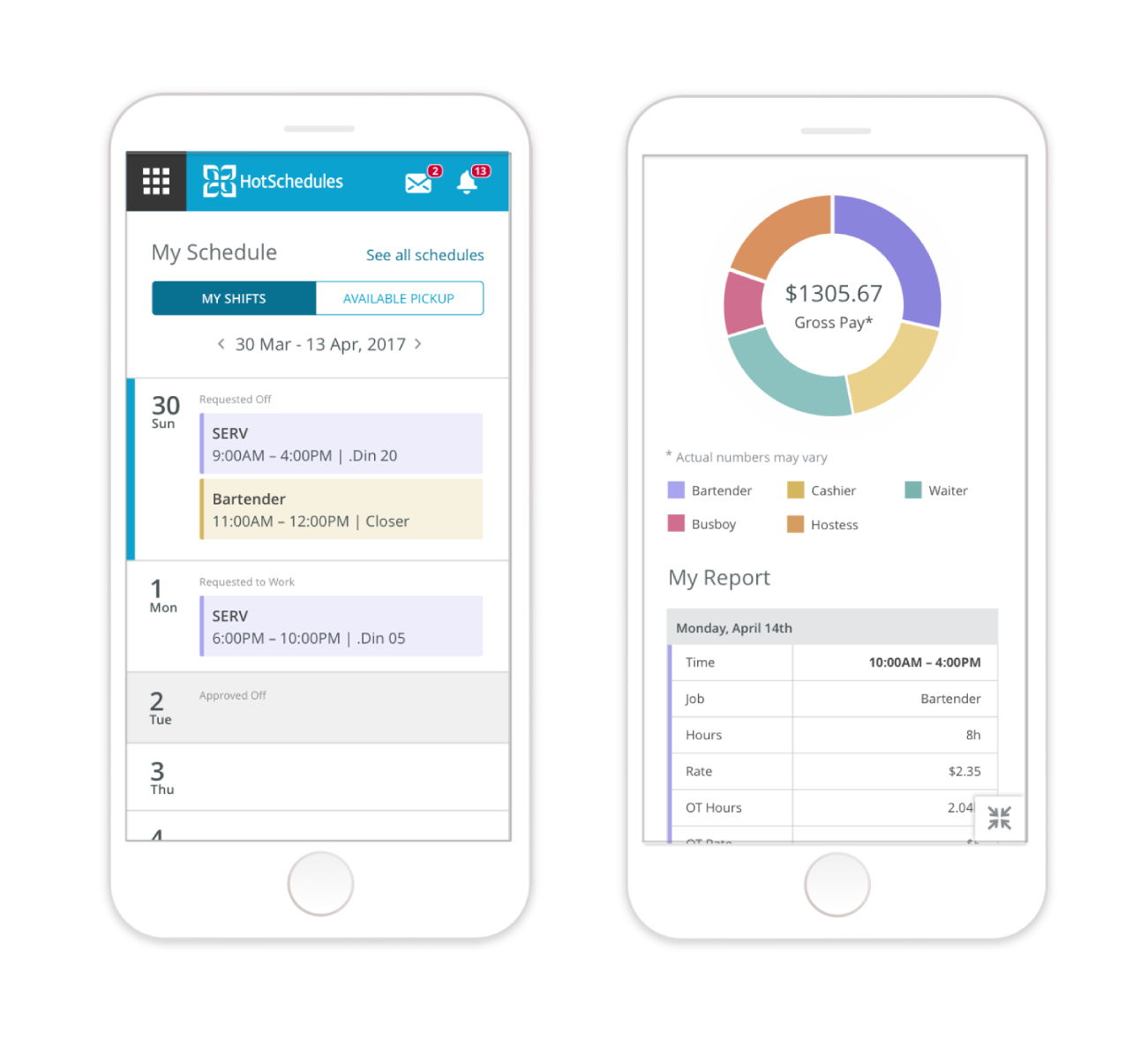
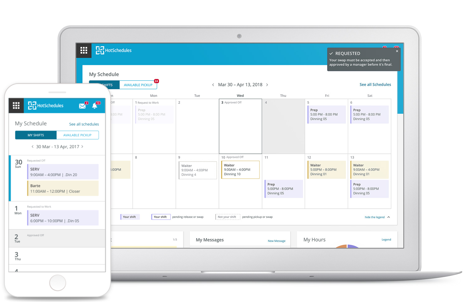
Solution: The new solution addressed usability issues of the old experience, was accessible on a mobile device, offered easier readability of the schedule, and allowed employees to view information about their hours.
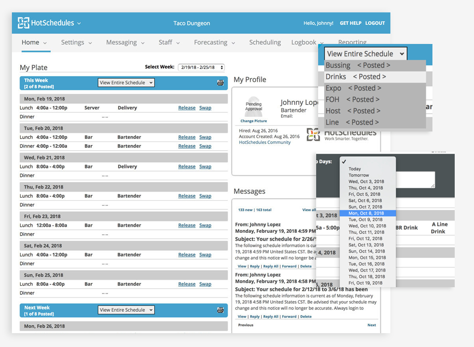
More on Process More on Final DesignExisting design
User and Customer Care rep interviews helped me to uncover the following pain points associated with the existing design:
The research made it clear that users often rely on their mobile devices to check their schedule. Google Analytics showed that 63% of the users logged-in on their mobile device. The home page needed to be responsive.
As an hourly employee, when I’m off work, I want to have a control over my schedule and earnings, so that I know what I can do and when I can do it.
The storyboard helped me start the conversations with users and get their feedback on how accurate the scenario was. It also made it easier to build empathy from the stakeholders and team members.
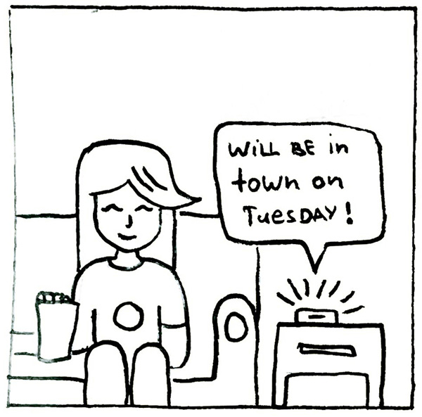
Sara is relaxing at home when she gets a message from a friend saying that she will be in town for a day.
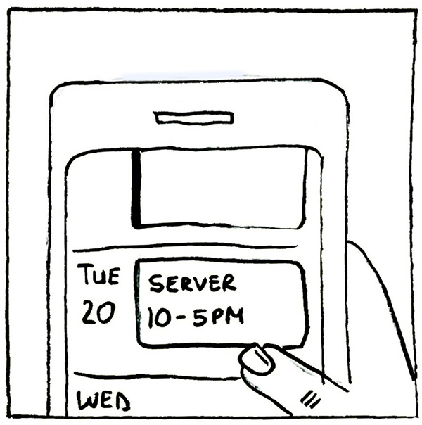
She nervously checks her schedule on her phone to find out she is scheduled to work that day.
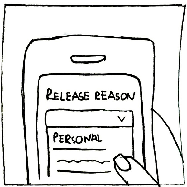
Using HotSchedules, Sara releases her shift. She is hopeful that somebody will pick it up soon.
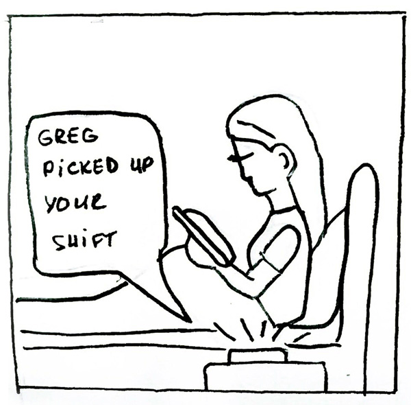
Later on that night, she gets a notification that her co-worker picked up her shift.
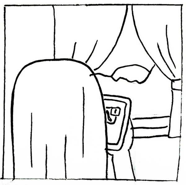
In the morning, she sees a notification that her manager approved the release.
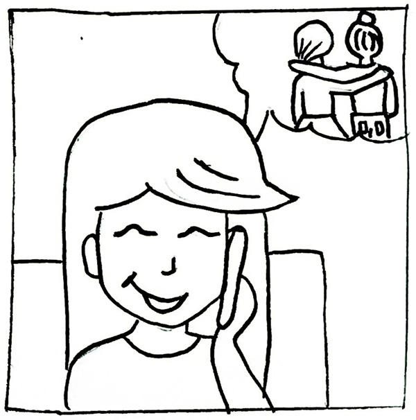
Excited, she calls her friend to make plans together.
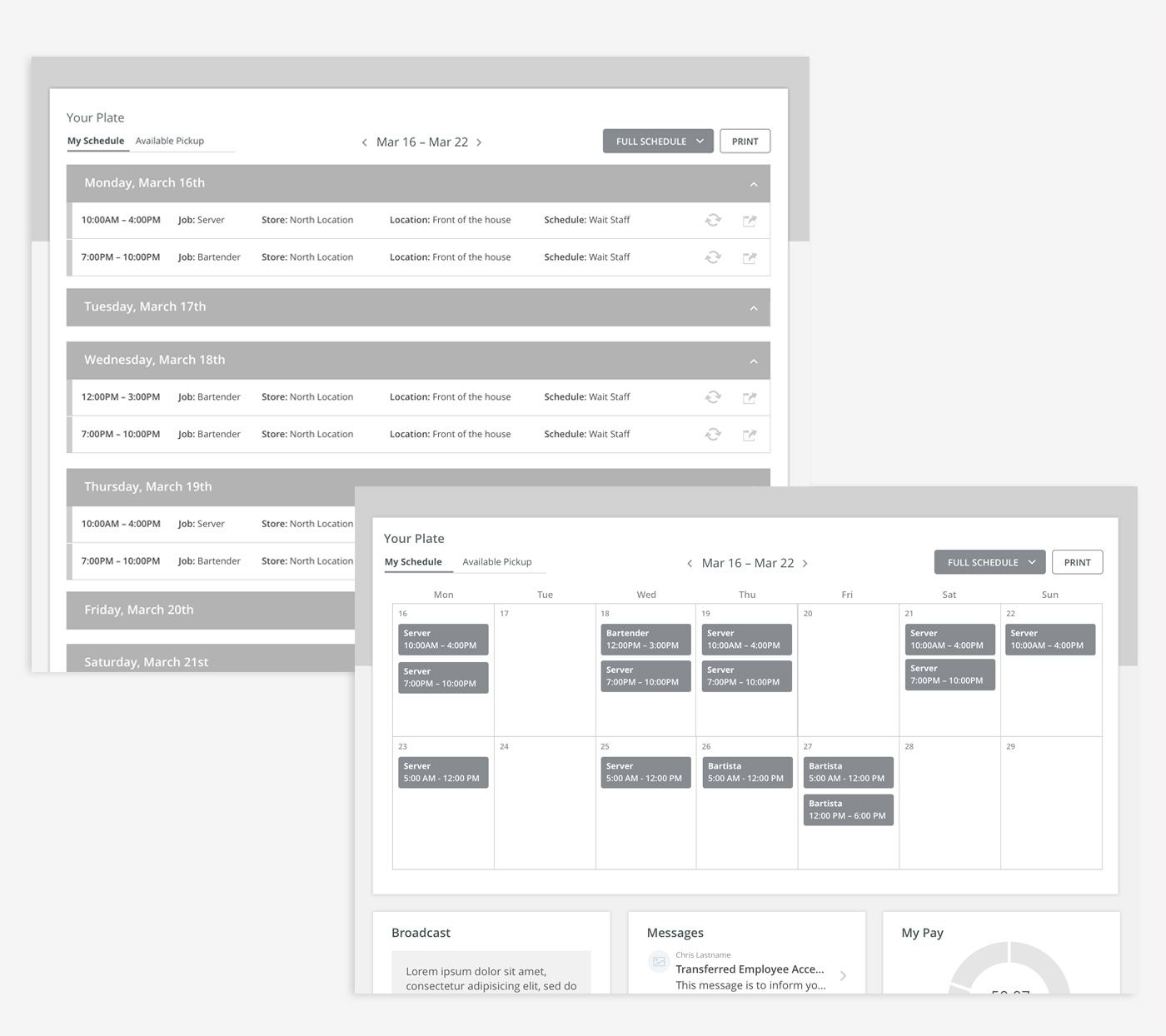
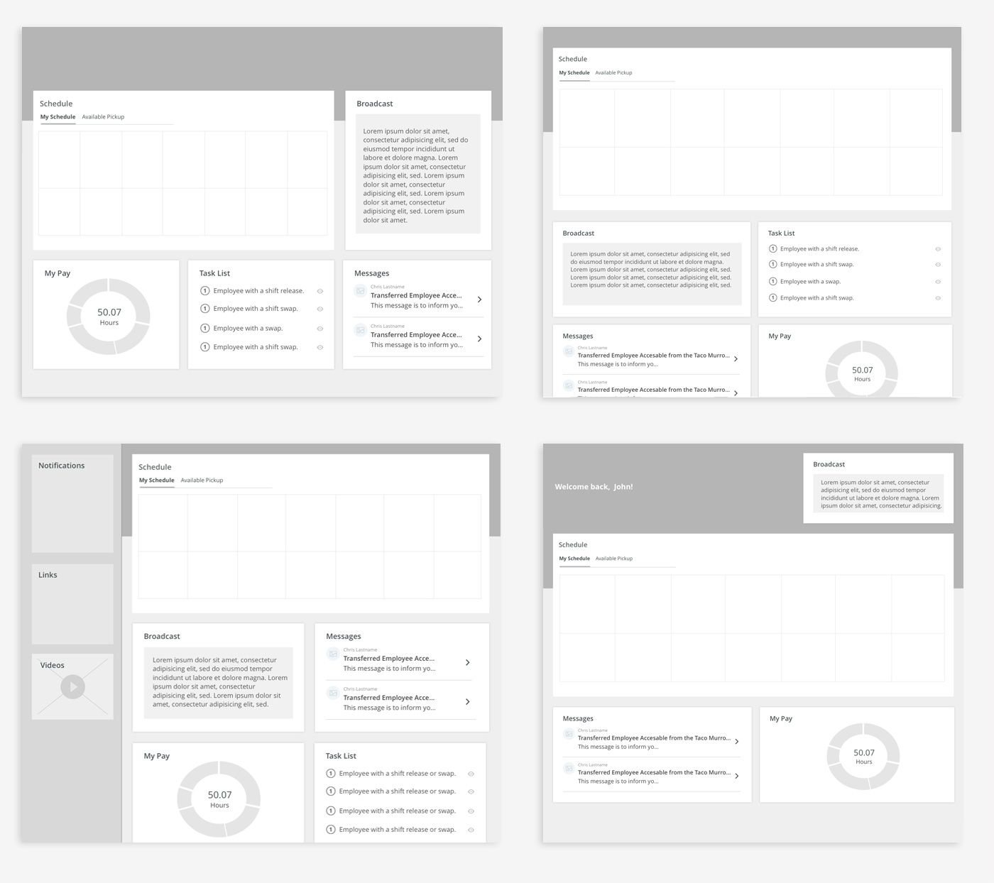
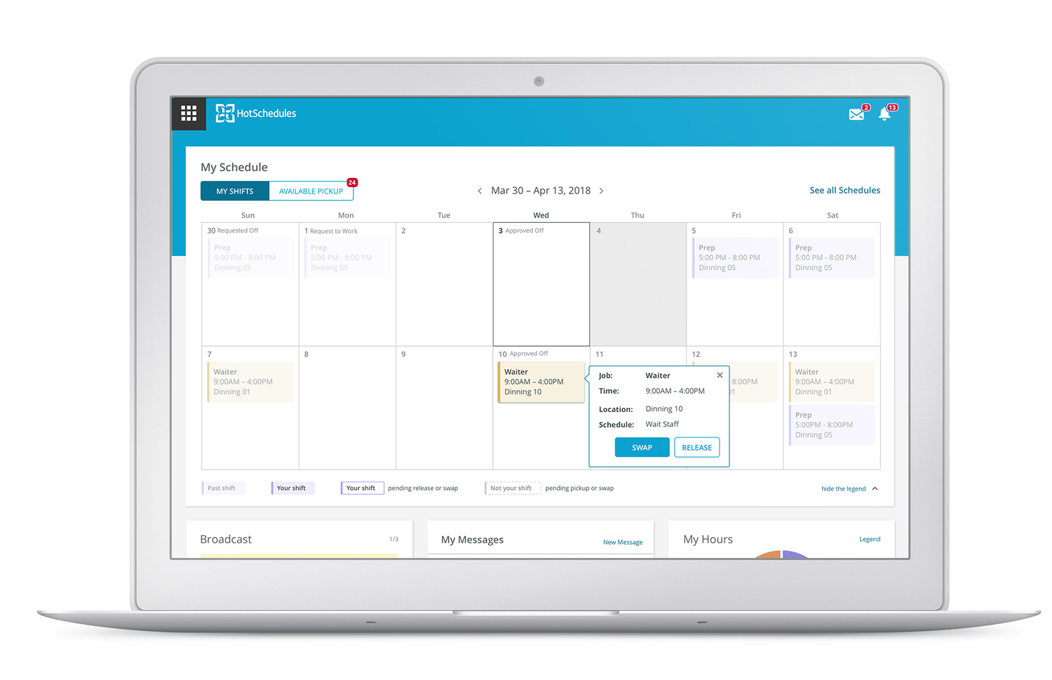
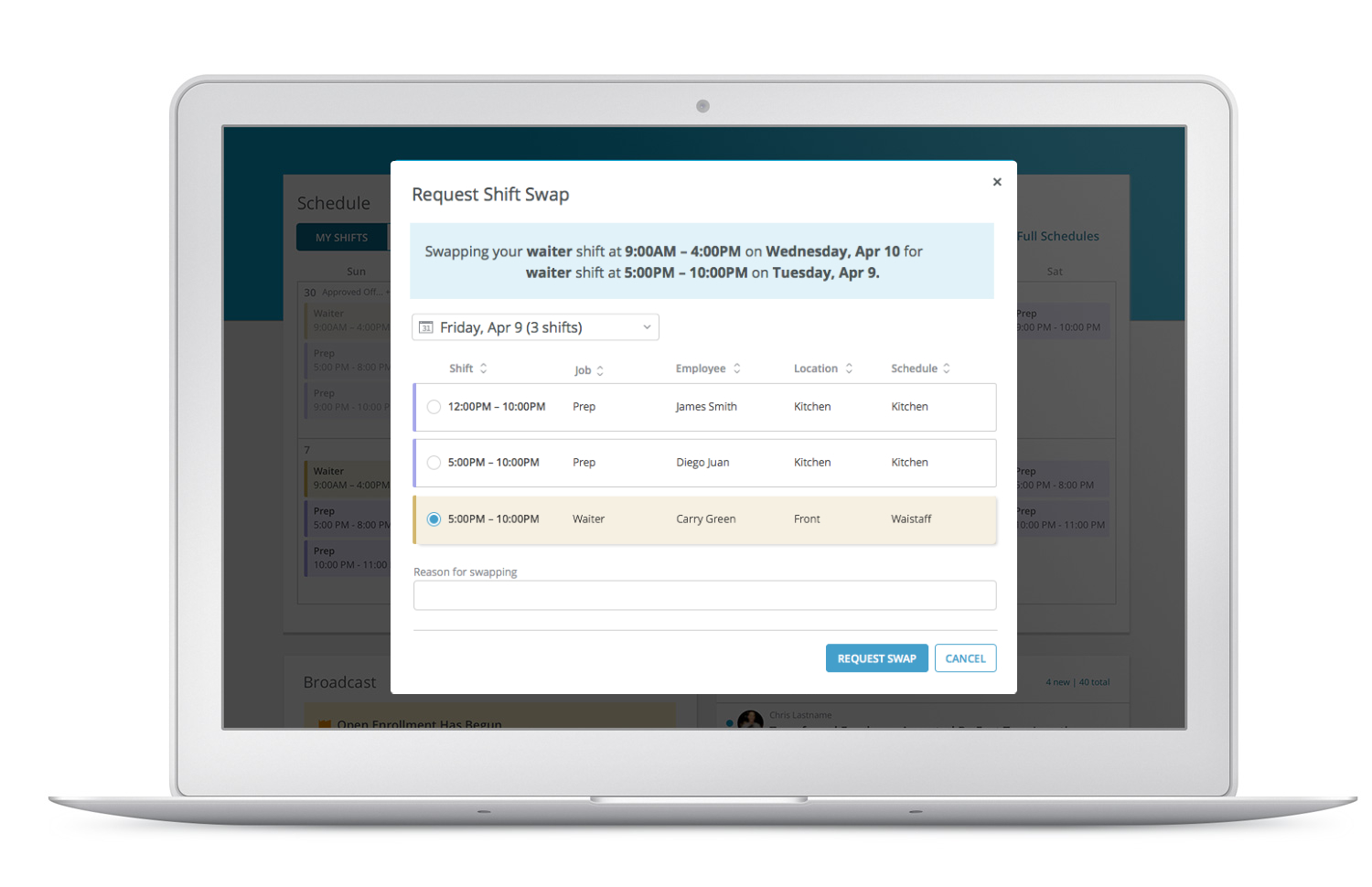
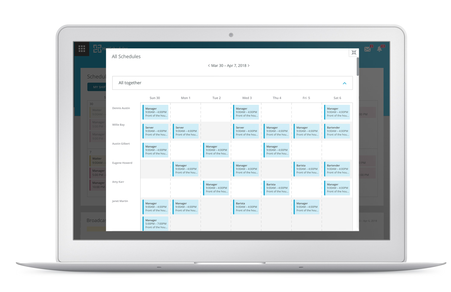
After wireframing the mobile experience, I've created two different desktop layout concepts. The list view was very similar to what users were used to. The calendar view was created to improve the readability of the schedule.
69% of online survey participants thought that the calendar concept made it easier to digest their schedule. We have also facilitated user sessions that helped to pinpoint some usability issues such as difficulty finding the tab for the shift pickups. After all changes were finalized, I worked on creating an implementation style guide that provided guidance on new design components and patterns.
The goal of the project was to increase the number of users who converted from a free trial version to the paid subscription. The secondary goal was to decrease the number of calls to customer service.
Empty states
Refresh the page if the video isn't playing
I collaborated with Lead Designer Dan Newcomer on creating new illustrations that would delight users. We decided to use a restaurant theme as our central concept. In addition, we sprinkled in some wit and humor through illustrating restaurant-related idioms or relatable restaurant work moments. Bringing out the human aspect of the service industry helped us create a more relatable product.